Widgets
Widgets are visual elements that enhance the aesthetics of your Board. Unlike Nodes, Widgets do not participate in the adventure mechanics; they are purely for visual aid and context. They serve as decorative or informational additions without impacting the functional structure of your adventure design.
Widgets include image widgets, icon widgets, text widgets, and group widgets.
Unlike Nodes, each Widget exists as a single Token on the Board. Deleting a Widget's Token removes the Widget from the Module entirely. Widgets can be named for easy identification in the Asset Tree, and they can be connected to other Assets using Links.
Image Widget
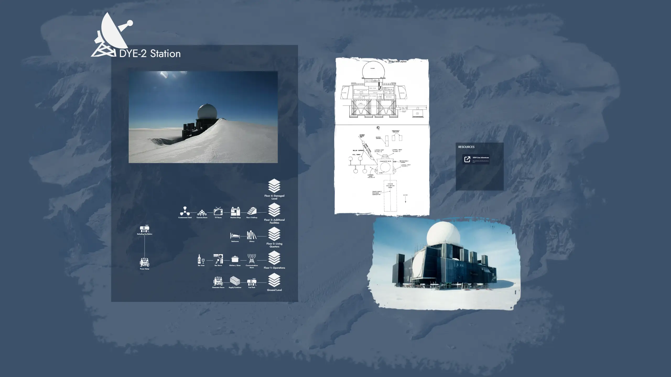
An Image Widget places an image directly on the Board as a decorative or illustrative element. Use it to add maps, illustrations, background art, or any visual that supports the atmosphere of your module without attaching it to a Node.
Images are selected from the Library, which includes your uploaded images and any images you have bookmarked from the icon collection or external sources.
Image Widgets support the following customization options:
- Border style and border color
- Corner width and corner height (independent controls for precise shape)
- Mask overlay
Icon Widget
An Icon Widget places a single icon on the Board. It is useful for quick visual markers, decorative elements, or symbolic annotations that do not require text or a full image.
Icons are selected from the Library, which contains tens of thousands of icons covering a wide range of themes and genres.
Icon Widgets support the following customization options:
- Icon color
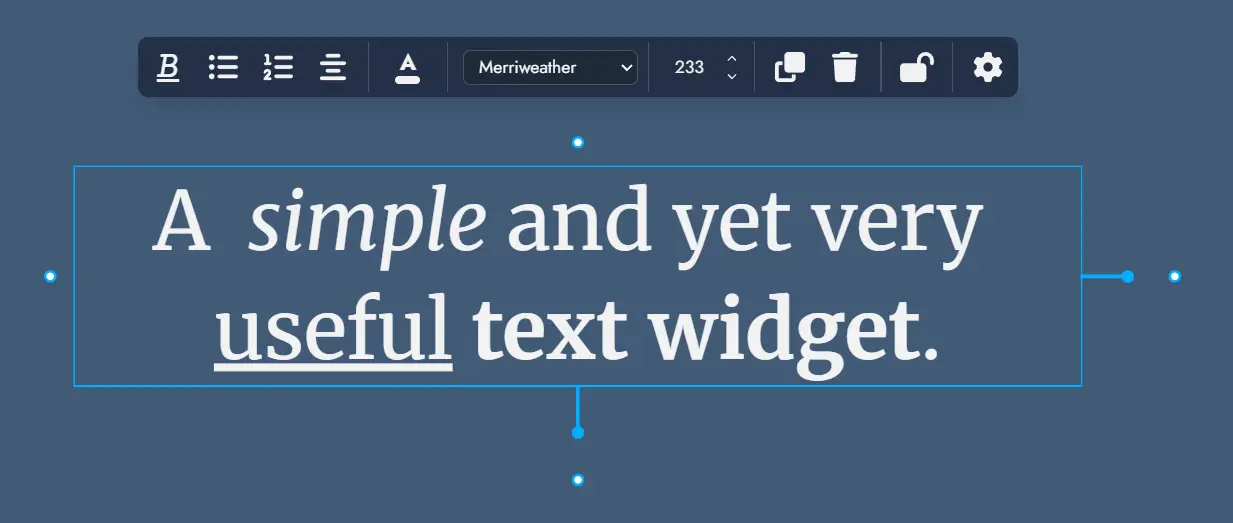
Text Widget
A Text Widget places a text label or annotation directly on the Board. Use it for section headings, captions, notes, or any freestanding text that is not tied to a Node.
Text Widgets support rich text formatting. The following formatting options are available directly in the widget:
- Bold, italic, underline, and strikethrough
- Numbered lists and bullet lists
Text Widgets also support the following customization options:
- Font selection (any font available in the Editor themes)
- Font size
- Border style and border color
- Corner width and corner height
Group Widget
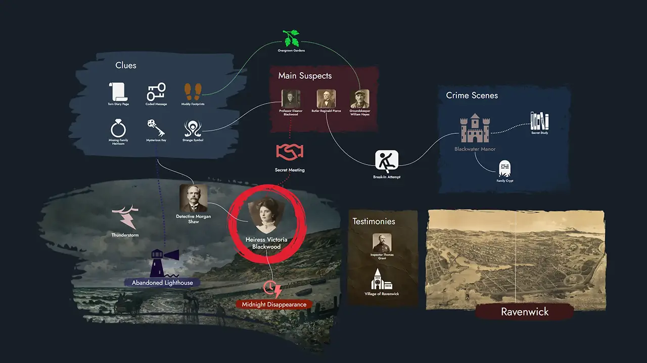
Group Widgets are a special Widget type designed for visual and organizational grouping on the Board. They let you visually delimit areas of your board, label regions, and apply background images or colors to create a clear spatial structure.
Unlike Nodes, Group Widgets hold no content of their own. Their purpose is layout and emphasis: meaning and structure remain within Nodes and Links.
Linking a Group Widget to a Node
A Group Widget can optionally be linked to a Node. When linked, double-clicking the Group Widget opens that Node directly in the Editor, making it a convenient shortcut to the Node's content while keeping the visual structure separate.
Customization
Group Widgets support the following customization options:
- Background image
- Background color
- Border style and border color
- Corner radius
- Title font selection
- Name Size: adjusts the font size of the Group Widget title. Title spacing adjusts naturally as the size changes.
- Horizontal and Vertical Offset: sliders that let you reposition the title freely within the Group Widget bounds.
- Masking
Migration from Group Nodes
Prior to version 0.17.0, grouping was handled by Group Nodes. Group Nodes have been retired and replaced by Group Widgets. Existing modules are automatically migrated: each legacy Group Node is converted into a Group Widget on the Board. Because Group Nodes could hold text content, a new generic Node is created for each migrated Group Node to preserve that content.